
Today we talked about graphics, both human-created and AI-generated. Obviously, the discussion stemmed into considerations about whether it’s a hindrance in creativity or a useful, time-saving tool that can be used by teachers and learners alike. I tend to see both sides of the argument: it depends on what we’re using it for. We have to be cognizant of the learning goals and how we use the technology available to us to complete those goals. Are we creating graphics to substitute or augment the information we present to students? For instance, we talked about dual coding theory. While visuals may be useful in addition to text for teaching purposes, they need to go hand-in-hand to produce the best learning environment, while not exceeding cognitive load for either code.
I think one other consideration to AI-generated graphics and images are whether they are actually showing what we want them to. Thinking about accuracy and validity is important. For an example, I searched for “basic diagram of a volleyball court to show athletes how to rotate and position themselves on the court” and this was one of the results:

For anyone who has played volleyball before, these lines are not accurate to an actual volleyball court and don’t show any useful information to rotation or position, but it looks pretty! Would it be useful for coaching? Not in the slightest. But it may make a decent logo or graphic to augment a presentation about rotations and positions.
Another search I had was “an instructional tool that shows 6 players on each side of a volleyball court to teach volleyball positions and rotations.” Here is a result:
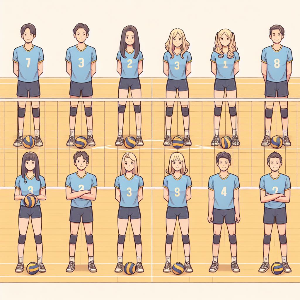
Obviously, this doesn’t show positioning in any way but it shows 6 players a side, so that’s something, I guess! Consider these prompts and image results to inform how we use AI-generated images to convey information to students. Is it showing what we want it to? Is it eye-catching? All these considerations are important in determining what images we select and why.